Art Direction Astrid Ortiz UX Elsa Camí Graphic Design Astrid Ortiz Client On Our Radar
On Our Radar It is a non-profit communication agency for communities without a voice.
They develop open source digital solutions to connect experts and service providers with the most marginal communities, those who live in the shadow of poverty or violence.
On Our Radar It is a non-profit communication agency for communities without a voice.
They develop open source digital solutions to connect experts and service providers with the most marginal communities, those who live in the shadow of poverty or violence.
The London medical team was developing a research study on the evolution of certain diseases in Malaysia. For this, they needed a digital tool that allowed them to follow and manage the work of local researchers.
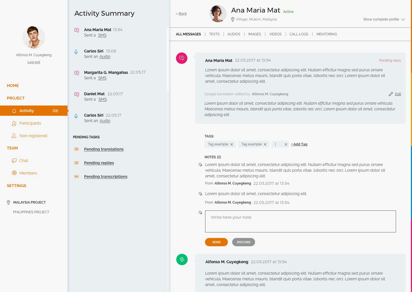
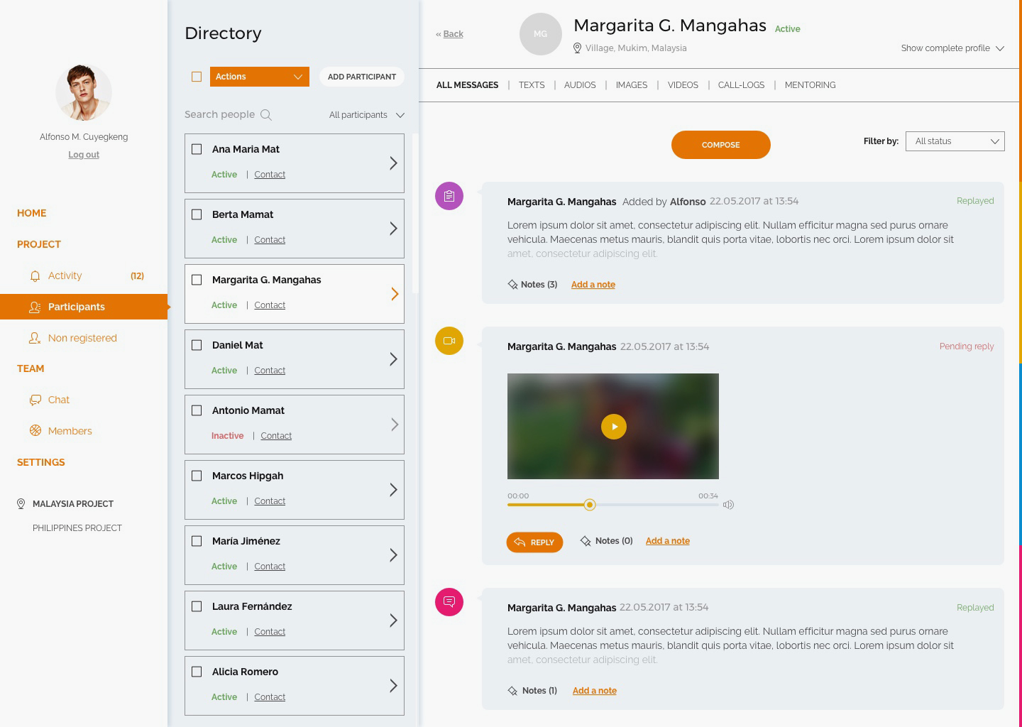
A dashboard where field research (patient messages and researchers' reports) were collected.


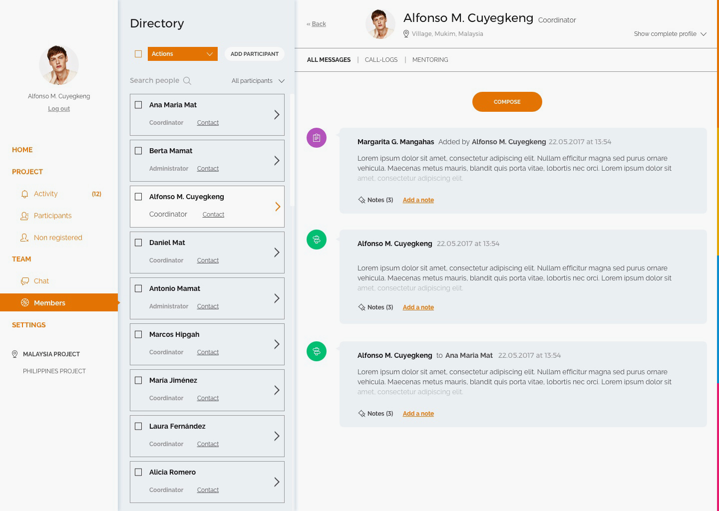
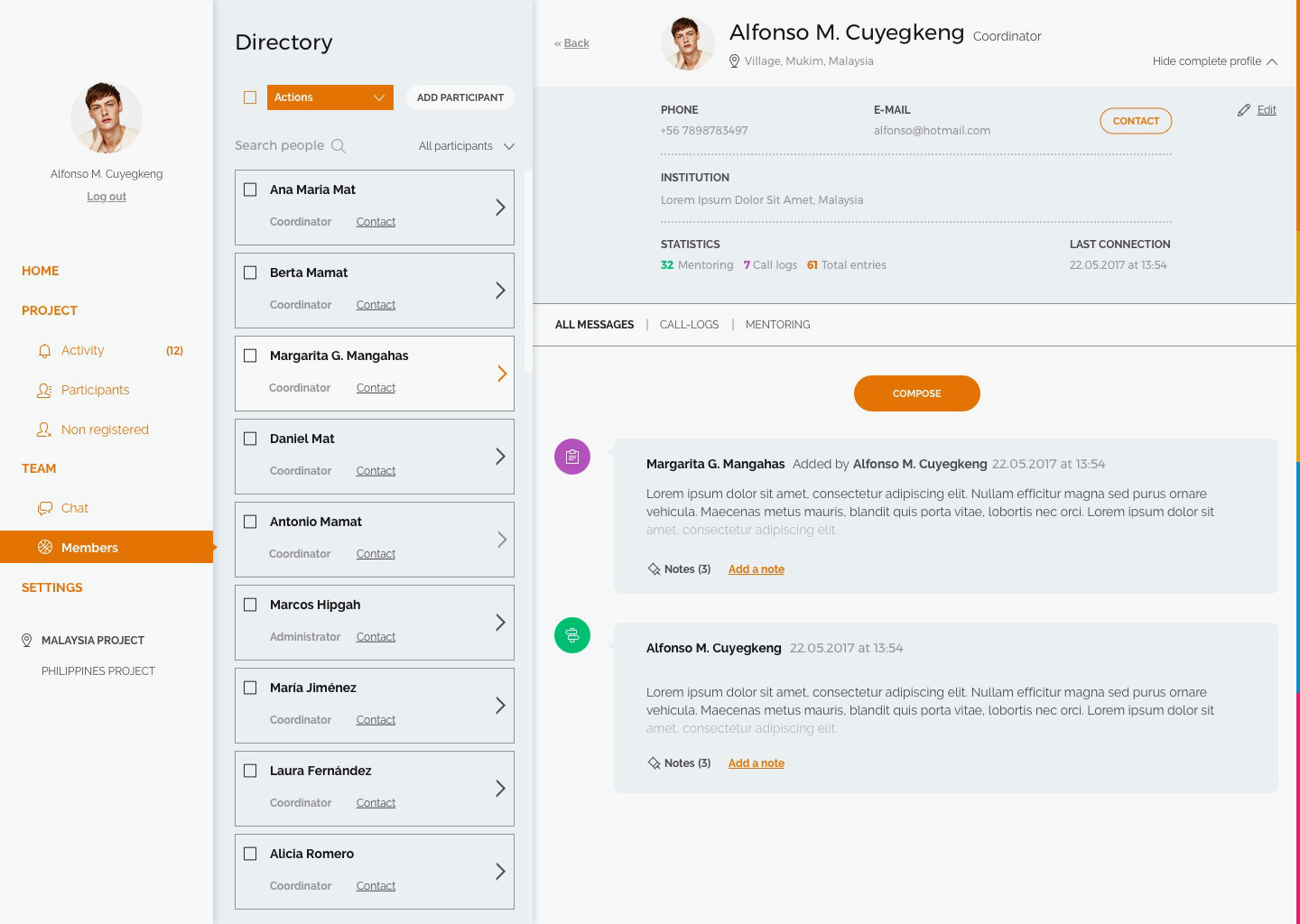
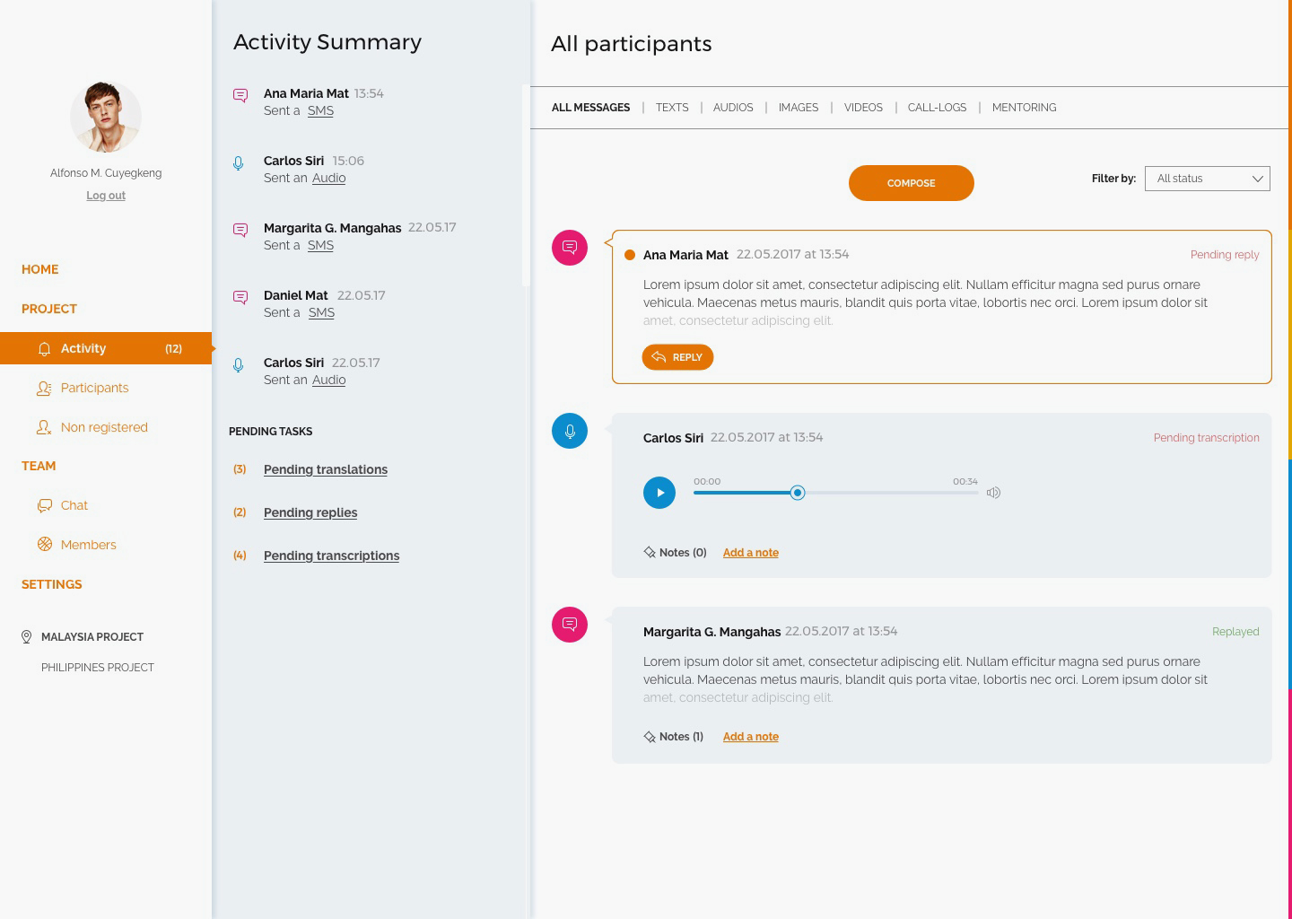
One of the most important challenges was the management of the annotations and communications. There were different types of messages (patient-researcher, researcher-patient, researcher-researcher, automatic platform-patient) sent in different formats (text, audio, video and image) and each of them had a specific use, so it was essential to understand the working methodology of the research team very well, to generate the correct flows and to group the information in the most logical way for them.
Another important requirement was to allow the team to manage specific tasks, as well as, to see the overall evolution of the project. And all this taking into account, that local researchers had very bad connectivity, so the design of the platform should be very light.

We organized the content in 4 large sections:
Home: where you can see the data and general evolution of the project
Project: Everything related to the research work, separated by patients or by temporality.
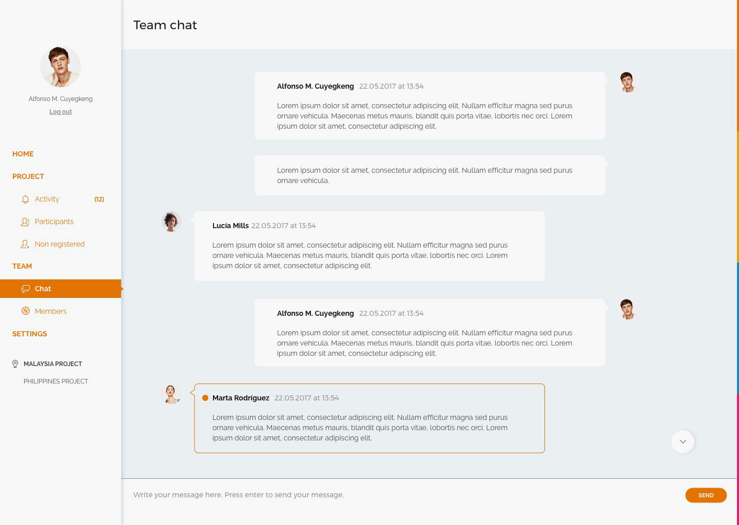
Team: internal communication between local and English researchers
Settings: Everything related to the management of the platform itself
One of the keys to the design was the structure of the page in three sections. That allows you to always know where you are and at the same time navigate quickly between patients or researchers.
Sidebar: always present to know where you are and receive notifications.
Central list: directory of people or recent activity, to select, search and create bulk actions for different people.
Right section: where detailed information is displayed.